The following question is answered by Emily York, Crown Point Senior Master Printer and author of the book Magical Secrets about Aquatint.
Dear Emily,
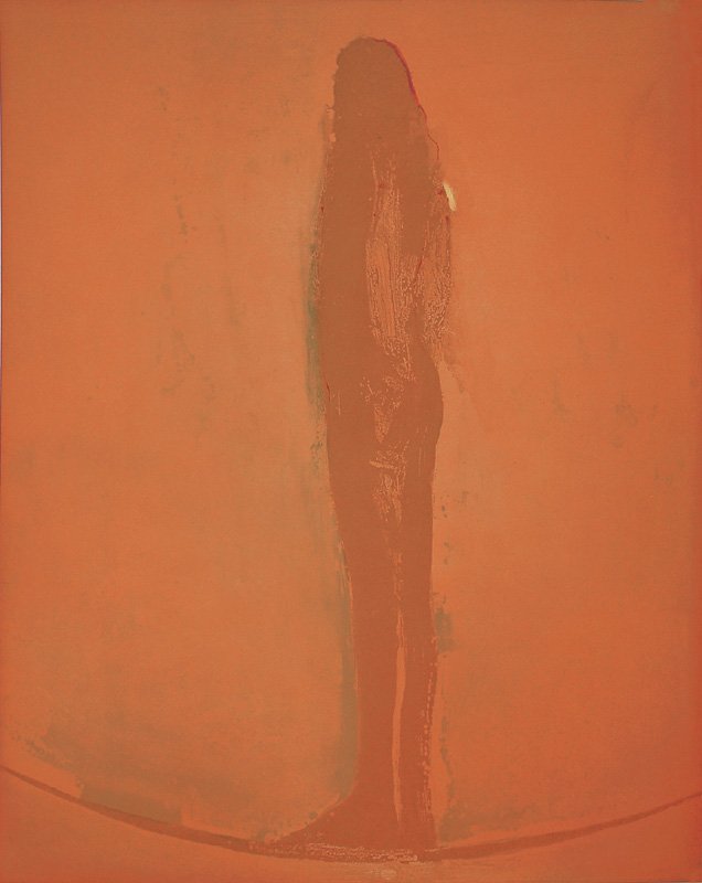
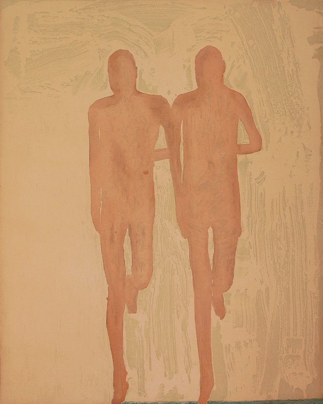
The [2005] Nathan Oliveira show [was] exquisite. Those luscious, deep, transparent backgrounds are most puzzling. How the hell did he do that?
– Barry Peterson, Sausalito, CA
Dear Barry,
I was the printer for Oliveira’s 2005 project where he made Angel Rocker and The Twin Runners. In both of those prints there are two full aquatint plates that make up the background color. In Angel Rocker the first plate printed is in a bright yellow, which you can see coming through in a small area on the angel’s shoulder where the top color plate was burnished down. The second plate printed has the figure on it and the subtle sanded green texture. The third plate was another full, flat aquatint that was printed in a rusty rose brown over the entire image. Oliviera had the rust color custom mixed by Gamblin especially for the project. He’d been dreaming about it for a long time. The layering of the aquatints produces a rich field of color. There is transparent base in each color, so they aren’t too heavy. Oliveira told me that his experience in lithography gave him a taste for what he calls “veils of color.” For some reason (probably the way the plate sits in the acid bath, possibly the way the rosin melts) these large plates always seem to etch more at the edges than in the middle, which works in our favor because when the two plates are printed together the center looks like it’s glowing. The images are quite amazing but technically pretty simple. The key is getting a nice smooth aquatint.
Regards,
Emily